
Your site is your digital store, it’s also the initial impression a lot of potential clients will have of your company. Unless it’s properly designed with a focus on professional web design, it might scare off visitors without you realising it. Bad web design irritates users, decreases conversions, and eventually loses in your sales. To ensure that your site isn’t driving customers away, let’s examine seven frequent web design errors that might be damaging your business and how you can repair them.

1. Slow Loading Speeds: The Patience Killer
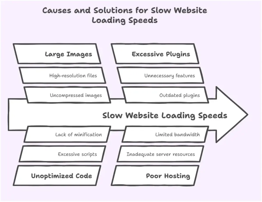
Did you know that 53% of mobile users abandon a site that takes longer than three seconds to load? People today expect instant gratification, and a slow-loading website is one of the fastest ways to lose visitors.
Why does this happen? Large images, unoptimised code, too many plugins, and poor hosting can all slow down your site. A slow website doesn’t just frustrate users; it also harms your search engine ranking.
How to fix it:
- Compress images using tools like TinyPNG.
- Use a reliable hosting provider with fast servers.
- Minimise the use of unnecessary plugins.
- Enable browser caching and use a Content Delivery Network (CDN) for faster global access.
If your website is taking too long to load, you’re already losing potential customers before they even see your content.
2. Poor Mobile Responsiveness: Ignoring the Majority
More than half of all web traffic now comes from mobile devices, yet many websites still need to be optimised. A website that looks great on a desktop but is challenging to navigate on a phone or tablet is a major turnoff for users.
Common mobile design mistakes include:
- Text that requires zooming to read because it is too small.
- Links and buttons that are too near one another
- Images or content that don’t scale properly on smaller screens.
How to fix it:
- Make use of a site design that is responsive, meaning it can adjust to various screen sizes.
- Regularly test your site on various devices.
- Make sure links and buttons are simple for touchscreen users to click.
- Make text readable without requiring zoom.
A well-executed mobile-friendly website design is crucial in today’s digital landscape. If your website isn’t mobile-friendly, you’re alienating a massive chunk of your audience and losing out on conversions. Ensure that your online presence is optimized for all devices to maximize engagement and drive business growth.
3. Disorienting Navigation: The Customer’s Worst Fear
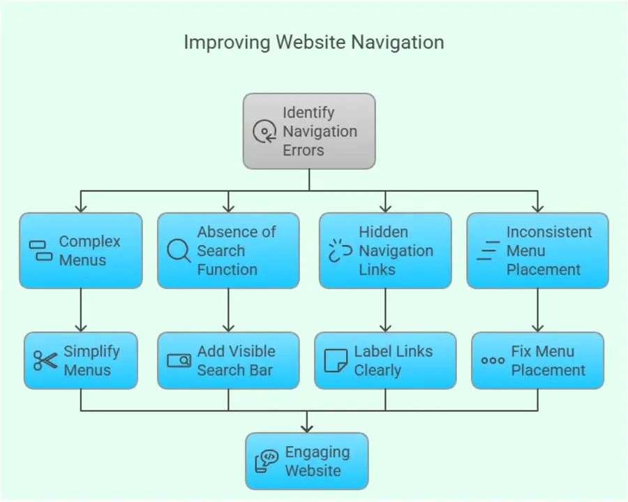
Have you ever gone onto a website and not been able to find the information you’re searching for? If your users can’t use your site clearly, they will become frustrated and go looking for a competitor’s site with better organisation.
Navigation errors are:
- Complex menus full of too many options.
- The absence of a clear search function.
- Hidden or poorly labelled navigation links.
- Inconstant menu placement.
How to fix it:
- Make your menu simple, with brief and descriptive labels.
- Employ a logical structure with dropdowns for subcategories.
- Have a visible search bar at all times.
- Position the navigation menu in a fixed location on every page.
A well-designed website with intuitive navigation and clear information architecture is essential for engaging visitors and driving conversions. By incorporating these fundamental principles of UX/UI website design, you can encourage visitors to linger, interact, and ultimately, convert.

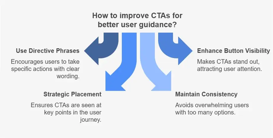
4. Weak Call-to-Actions (CTAs): Failing to Guide Visitors
Imagine walking into a shop and not knowing where to go or what to do next. That’s exactly how visitors feel when they land on a website without clear Call-to-Actions (CTAs). Your CTA should tell users what step to take next—whether it’s making a purchase, signing up for a newsletter, or contacting you for more information.
Common CTA mistakes include:
- Buttons that are hard to find or don’t stand out.
- Vague wording like “Click Here” instead of “Get Your Free Trial Now.”
- Too many CTAs on one page, overwhelming the user.
How to fix it:
- Use phrases like “Start Your Free Trial” or “Shop Now” that are forceful and directive.
- Make buttons bold and visually distinct.
- Place CTAs in strategic locations, such as above the fold and at the end of blog posts.
- Keep CTAs consistent and avoid overwhelming users with too many options.
A compelling CTA can significantly improve conversion rates, guiding visitors towards meaningful actions.
5. Poor Use of White Space: The Cluttered Nightmare
A cluttered website with excessive text, images, and flashy elements can overwhelm visitors and make your content difficult to digest. Many businesses believe that packing their site with as much information as possible is helpful, but in reality, it creates confusion.
White space (also known as negative space) is crucial for a clean, modern, and readable website design. It helps direct attention to important elements and makes content easier to process.
How to fix it:
- Space out content sections to improve readability.
- Subheadings and bullet points can be used to divide lengthy text passages.
- Avoid stuffing too many elements onto a single page.
- Ensure there’s enough spacing around images and buttons.
- A clean and well-structured layout ensures visitors stay focused on your message rather than feeling overwhelmed.
For the best website design for small business, it’s essential to prioritize simplicity and clarity. A well-designed website can help small businesses establish credibility and attract more customers. By incorporating white space and a clean layout, small businesses can create a professional and engaging online presence.
6. Poor-Quality or Unreliable Design: Losing Credibility Immediately
Would you do business with a company that has an outdated, do-it-yourself-looking website? Most won’t. Your site needs to convey professionalism and credibility, or customers will be hesitant to do business with you.
Common credibility-killing mistakes include:
- Poor-quality images or stock photos that feel generic.
- Inconsistent fonts and colours that make the site look unprofessional.
- Outdated design elements from decades ago.
- Lack of security features like SSL encryption.
How to fix it:
- Use high-quality images and custom graphics where possible.
- Stick to a consistent font and colour scheme that aligns with your brand.
- Regularly update your site’s design to match modern trends.
- Ensure your site has an SSL certificate for security (look for “https” in the URL).
A professional, visually appealing website helps build trust with visitors, increasing the likelihood of them becoming paying customers.
7.Lack of SEO Optimisation
Being Invisible to Customers Your website can be a feast for the eyes, but unless you get it search engine optimised, potential customers might never even find it. Organic traffic for your website can only be achieved by employing Search Engine Optimisation.
Let’s look at seven of the most prevalent web design mistakes that are likely damaging your business and how to fix them.
Common SEO mistakes include:
- No keyword strategy or poorly optimised content.
- Missing meta descriptions and alt text for images.
- Slow page speeds affecting search rankings.
- No internal linking structure to improve navigation.
How to fix it:
- Research and include suitable keywords in your writing.
- Write effective meta descriptions for all pages.
- Optimise images and improve loading speed.
- Use internal links to connect related content.
Good SEO ensures your website appears in search results, bringing in more potential customers.
Conclusion
Your website is a strong customer acquisition and conversion tool – that is, if it’s well-designed. Effective website design is crucial for captivating visitors and driving business growth. By steering clear of these seven most common mistakes – slow page loads, terrible mobile responsiveness, confusing navigation, weak calls-to-action, cluttered design, low credibility, and poor SEO – you can create a website design that fuels business success.
Is your website making any of these mistakes? Now is the time to fix them and start turning visitors into loyal customers.
FAQs
Q: How frequently should I make design changes to my website?
A: It’s recommended to refresh your website design every 2–3 years to keep it modern and aligned with user expectations.
Q: How do I know if my site is mobile-friendly or not?
A: Test your site using Google’s Mobile-Friendly Test tool to observe how your site functions on various devices.
Q: How do I make my website load faster?
A: Optimise images, enable caching, reduce unnecessary plugins, and choose a high-quality hosting provider.
Q: Why is SEO so important for my website?
A: SEO helps your website rank higher in search engines, making it easier for potential customers to find your business online.